Visualizing Rest as Resistance, Annual Rest Pause Illustrations for FRIDA
with FRIDA | The Young Feminist Fund
Client
FRIDA | The Young Feminist Fund
Relationship
Since 2020
Services
Visual Design, Illustration
Illustrating rest as a return to rhythm and community.
Through cozy chaos, quiet rituals, and earth-bound stillness, we shaped a three-year narrative arc that mirrored FRIDA’s values: care, community, and cyclical renewal.
Introduction
Each year, FRIDA enters a collective organisational pause—an intentional act of feminist resistance, healing, and recalibration. Unlike traditional institutions that valorize hustle, FRIDA embraces rest as strategy, not a reward. Our task for three consecutive years was to visually communicate this radical pause—not as absence, but as presence.
We created a series of annual illustrations that reflect this commitment to slow time, softness, and collective restoration, grounded in the diversity and realities of the global feminist ecosystem FRIDA serves.
Design Intentions
Our visual strategy focused on these guiding intentions:
- Center care without erasing the emotional and digital labor many carry
- Show diverse bodies at rest: alone, in community, in nature, in clutter
- Avoid sterile minimalism; instead, embrace warmth, color, and storytelling
- Reflect the cyclical nature of FRIDA’s pause through rhythm, repetition, and seasonal energy
Illustration Over Three Years
2021: Cozy Chaos & Digital Overflow
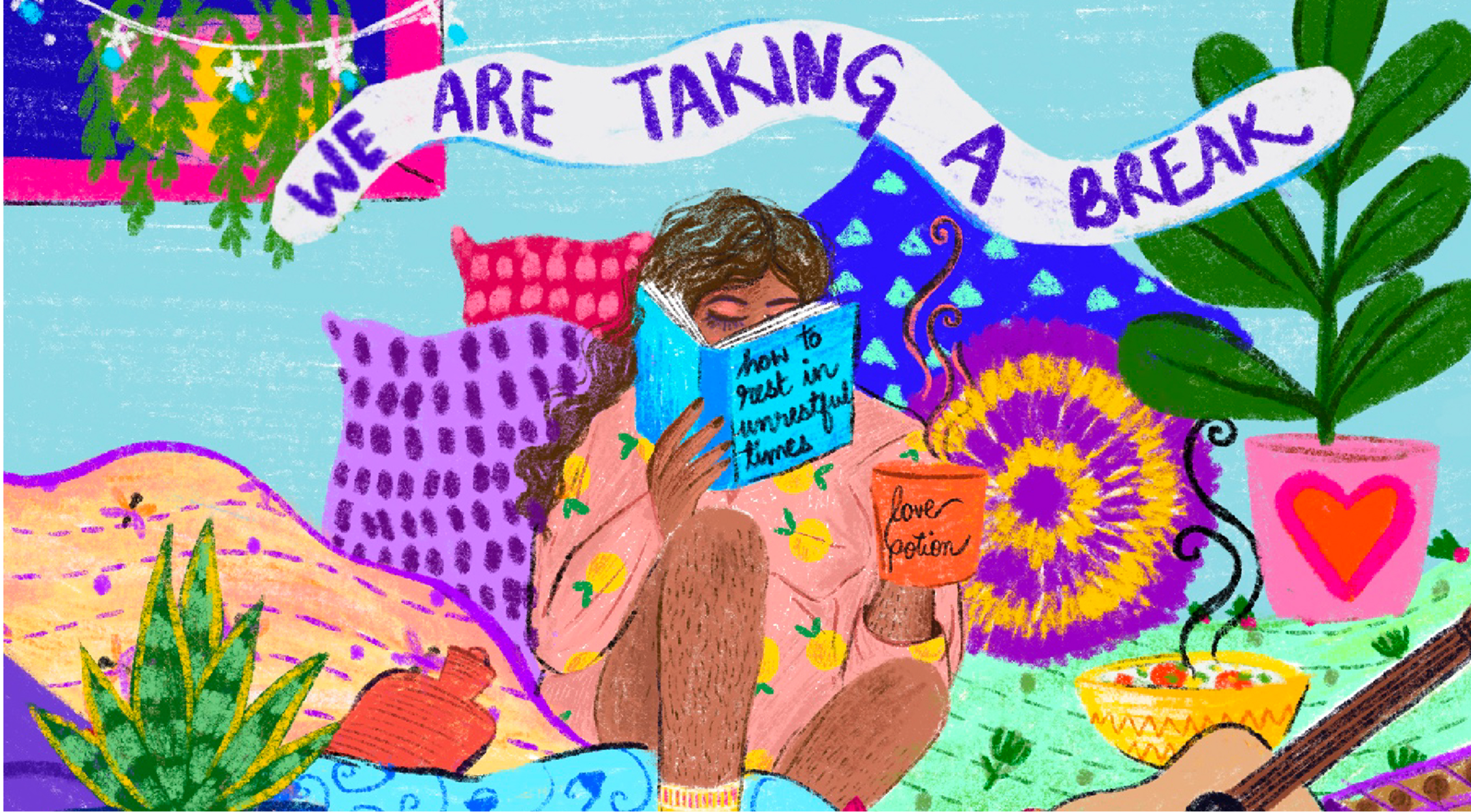
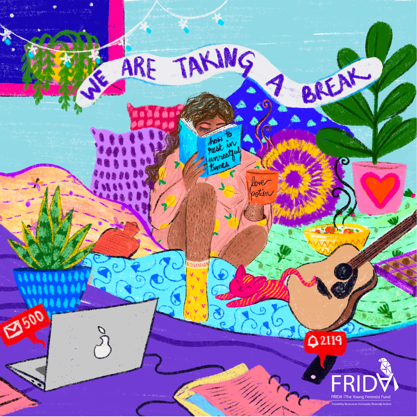
The first illustration leaned into the messiness of burnout recovery. A figure sits surrounded by pillows, unread emails, love potions, and books titled How to Rest in Unrestful Times. Despite the chaos, there’s tenderness: socks, houseplants, a cat curled beside a guitar. It’s an image of choosing rest even when things feel unfinished.
Stylistic notes: Crayon textures, clashing patterns, dreamlike colors—mirroring the overstimulated mind learning to slow down.
2022: Rest as Ritual
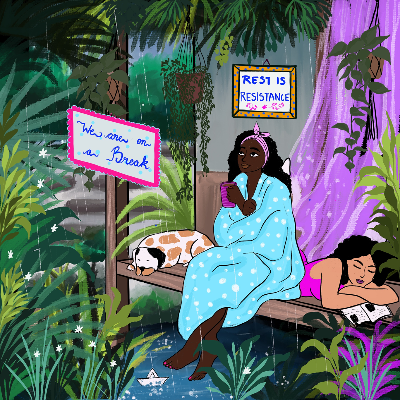
In the second year, we moved outdoors—to a lush, rainy garden where two figures lounge in pajamas, tea in hand, dog at their feet. The sign reads Rest is Resistance, a framed mantra hanging like sacred art. The scene evokes quiet companionship and the intimacy of doing nothing together. Here, rest is not escape—it’s a return to rhythm and community.
Stylistic notes: Deep greens and purples, raindrops falling through ferns, textures of soft fabric and earth.
2023: The Earth Rests Too
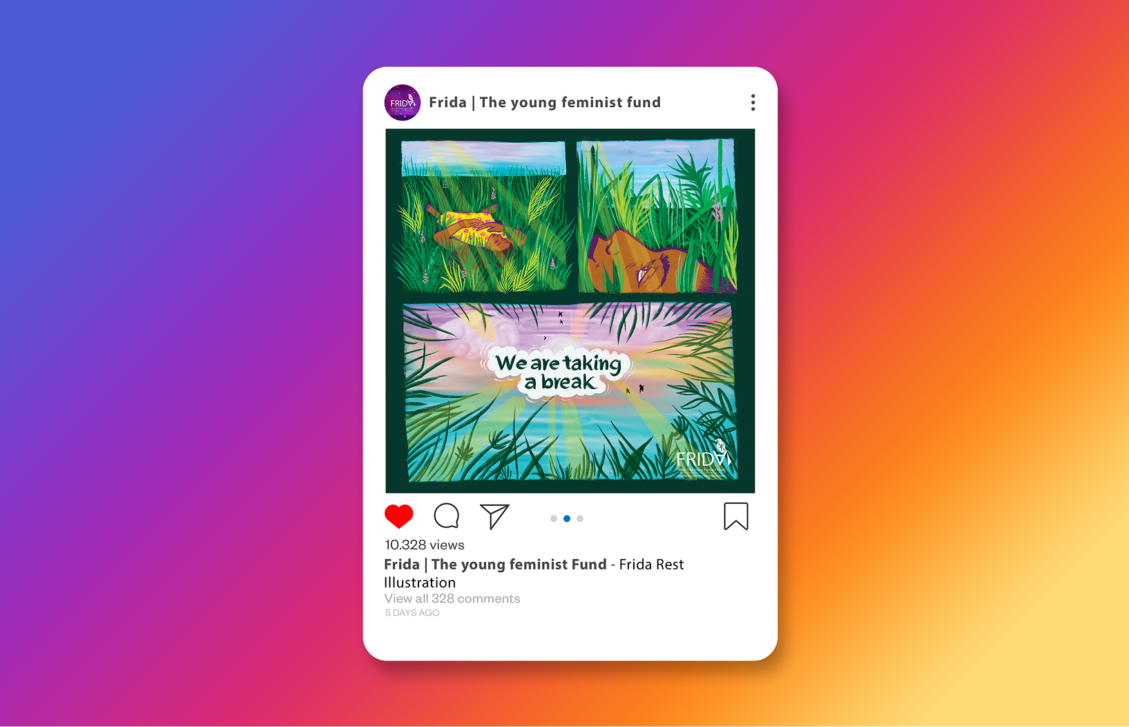
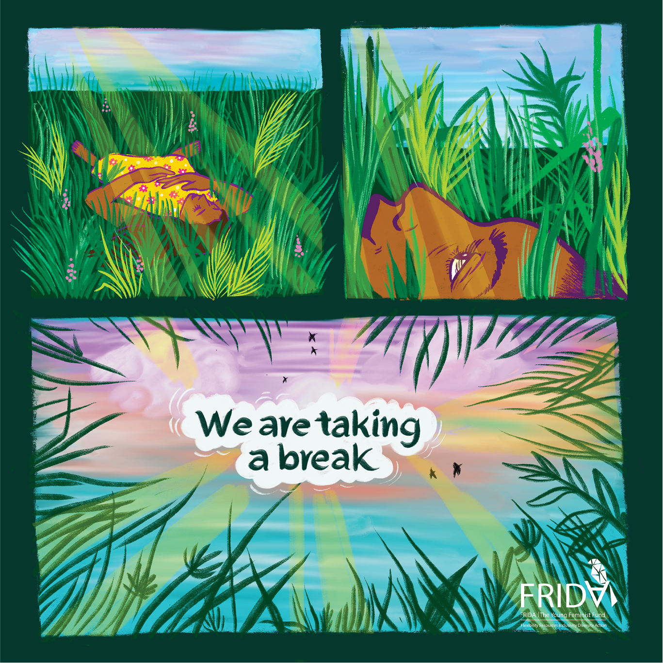
The third year’s illustration moves into the wild. A comic-style panel sequence shows overgrown grass, a sleeping animal, a figure blending into the land, and finally, a wide open sky. Text reads: We are taking a break. It’s an homage to the non-human world—a reminder that everything in nature pauses. This was our most minimal piece, but also the most spacious.
Stylistic notes: Earthy and greens, sunrise gradients, layered blades of grass—an ode to quiet growth.
Across All Three
- Characters are non-tokenizing and diverse in body, skin tone, expression, and surroundings
- Visual cues (books, food, plants, art) anchor the viewer in everyday realities
- A recurring theme of setting boundaries in a world that expects constant output (closed laptops, unread notifications, turned-away glances)
Impact & Reception
- The illustrations became a cherished visual tradition across FRIDA’s social media and community spaces
- Followers shared how the art helped them feel “permission to pause,” “held,” and “seen in their own fatigue”
- Other feminist funds referenced the series as inspiration for slowing down their own digital language
Conclusion
These annual illustrations were not announcements. They were invocations—gentle disruptions in the scroll, invitations to rest, and visual affirmations of FRIDA’s unapologetic politics of care. Through storytelling, texture, and tenderness, we co-created a visual rhythm of rest as radical practice.