Stories of Girls’ Resistance – Designing an Interactive Map of Power and Possibility
with Stories of Girls’ Resistance

Client
Stories of Girls’ Resistance (co-led by Purpose, FRIDA | The Young Feminist Fund, and others)
Relationship
Services
Visual Design, Illustration, Interactive Map, Website Design
A river of stories, flowing with resistance and return
Designed an interactive storytelling map that traces the power of girls’ resistance across place, time, and imagination. More than navigation, it’s an invitation to witness, wander, and walk beside their truths.
Introduction
At We Are Stories, we are passionate about creating digital experiences that don’t just inform—they move, resonate, and invite participation. When the Stories of Girls’ Resistance (SGR) team came to us, they didn’t just want a website—they wanted an invitation. A portal. A playful-yet-profound way to walk alongside girls’ lived realities and radical imaginations.
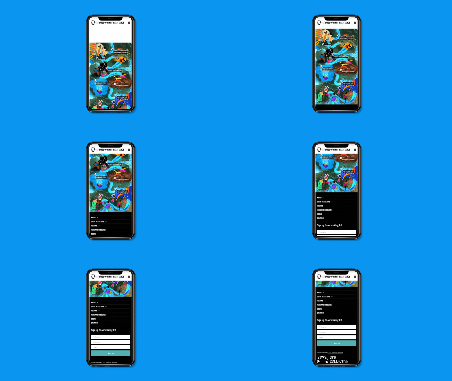
We collaborated to create an interactive map navigation tool—a visual journey through resistance, resilience, and revolution. Designed for both web and mobile, the navigation tool lets users hover, explore, and immerse themselves in a dynamic storytelling landscape where each chapter is a milestone in girls’ fight for justice.
About Stories of Girls’ Resistance
SGR is a global learning and storytelling initiative rooted in the resistance journeys of girls across the world. It challenges the narrow, often tokenistic portrayals of girls and instead centers their lived experiences, strategies, and dreams. The initiative draws from hundreds of stories, movements, and research to understand how girls resist oppression and imagine liberation. This project is co-led by Purpose, FRIDA, and other grassroots allies who bring years of commitment to girl-centered activism.
Learn more: www.storiesofgirlsresistance.org

Design Objectives
- Create a non-linear, intuitive and interactive map that visually guides users through six powerful chapters.
- Bring the spirit of the research to life in a format that invites curiosity, reflection, and exploration.
- Ensure responsiveness and ease of use across web and mobile.
- Infuse the tool with symbolism, color, and character that feels true to the stories and the people they come from.
Our Approach: Turning Research into Storyworlds
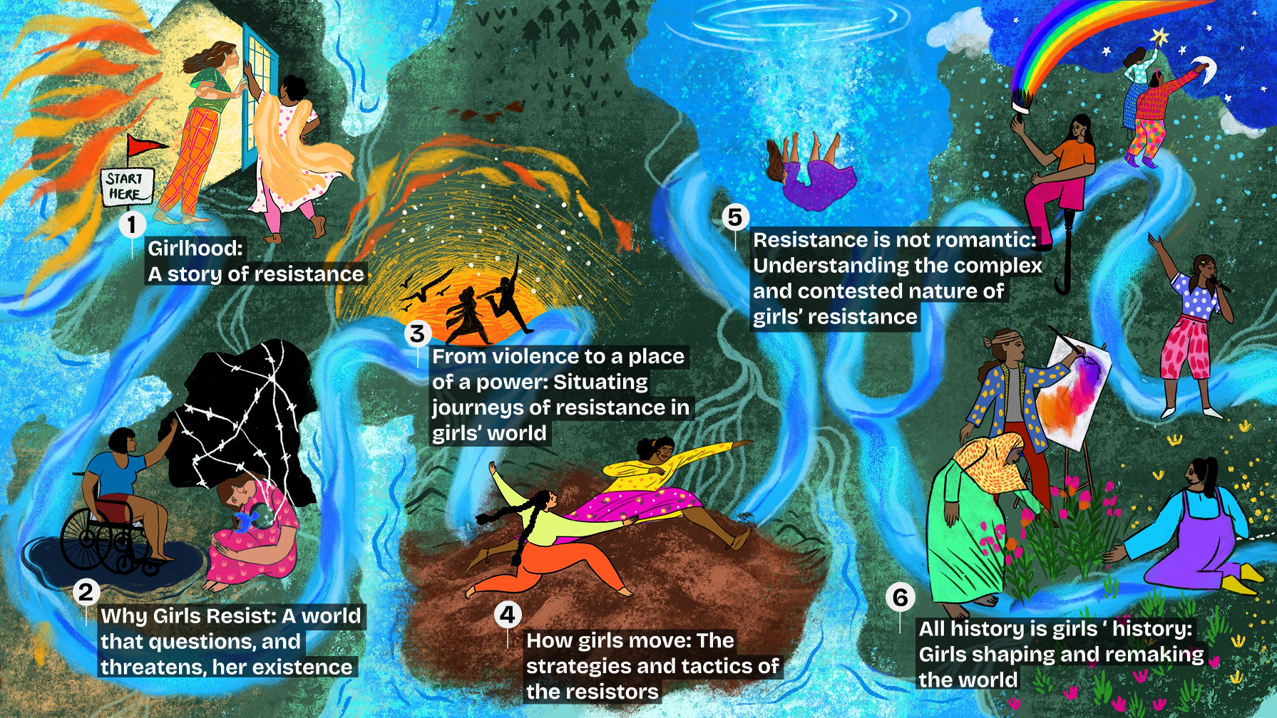
We were handed a rich, complex synthesis of research and storytelling. Instead of laying it out in a traditional website format, we conceptualized it as a narrative river—a flowing, living, evolving terrain of girlhood and resistance.
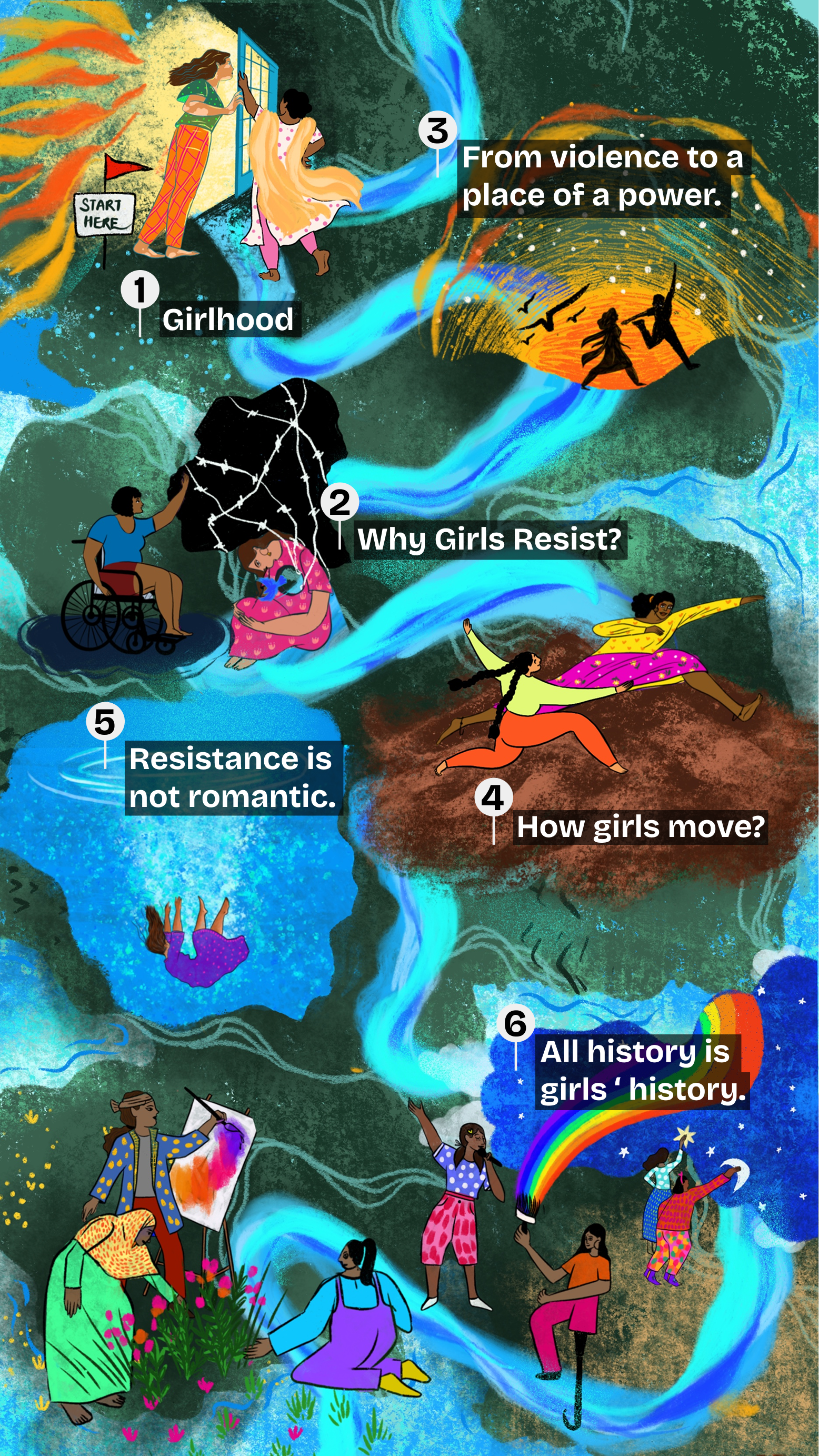
Each chapter became a milestone, marked by vivid illustrations and symbolic moments:
- Girlhood: A story of resistance
- Why Girls Resist: A world that questions, and threatens, her existence
- From violence to a place of power
- How girls move: The strategies and tactics of the resistors
- Resistance is not romantic
- All history is girls’ history
The user begins at the edge of this illustrated world with a “Start Here” sign and traverses a visual narrative by hovering or tapping over each milestone.
Building Interactivity: We worked closely with developers to build in hover and click states for web, and tap interactions for mobile. Each illustrated zone opens into a dedicated webpage, bringing users to the full narrative chapter. This seamless transition between art and content helped make the tool feel alive—like a living map girls themselves might draw in the margins of a notebook or the walls of their worlds.
Illustration & Visual Style
- Dreamy, hand-drawn textures
- Stylized characters in movement, dialogue, or pause
- A color palette inspired by fire, water, soil, and sky
- Metaphors like rivers, portals, storms, threads, and stars
Our visual north star was clear: Girls are not victims. They are actors, artists, and architects of resistance. Every visual choice was made with care to reflect that truth.
Challenges We Tackled
- Mobile responsiveness: Ensuring the interactive map functioned just as smoothly on small screens required careful layering, simplified path tracing, and adaptive hover-to-tap logic.
- Maintaining narrative flow: While each milestone stands alone, the user journey had to feel fluid and coherent. This meant structuring the map like a storybook river, with colors and illustrations guiding users without a strict linear path.

Impact
- The interactive map was successfully launched as the central storytelling entry point of the SGR site.
- Girls and young feminist partners across the world have used the tool to host community conversations and share their own narratives.
- The experience has been described as “intuitive,” “magical,” and “inviting—like being led by girls themselves.”