Our Future India | Visual Identity Design for a Youth-Led National Conversation
with United Nations Foundation – Our Future Agenda, Council on Energy, Environment and Water (CEEW)
Client
United Nations Foundation – Our Future Agenda, Council on Energy, Environment and Water (CEEW)
Relationship
Since 2021
Services
Visual Identity Design, Brand Strategy, Youth Co-Creation
Visual Identity Design for a Youth-Led National Conversation
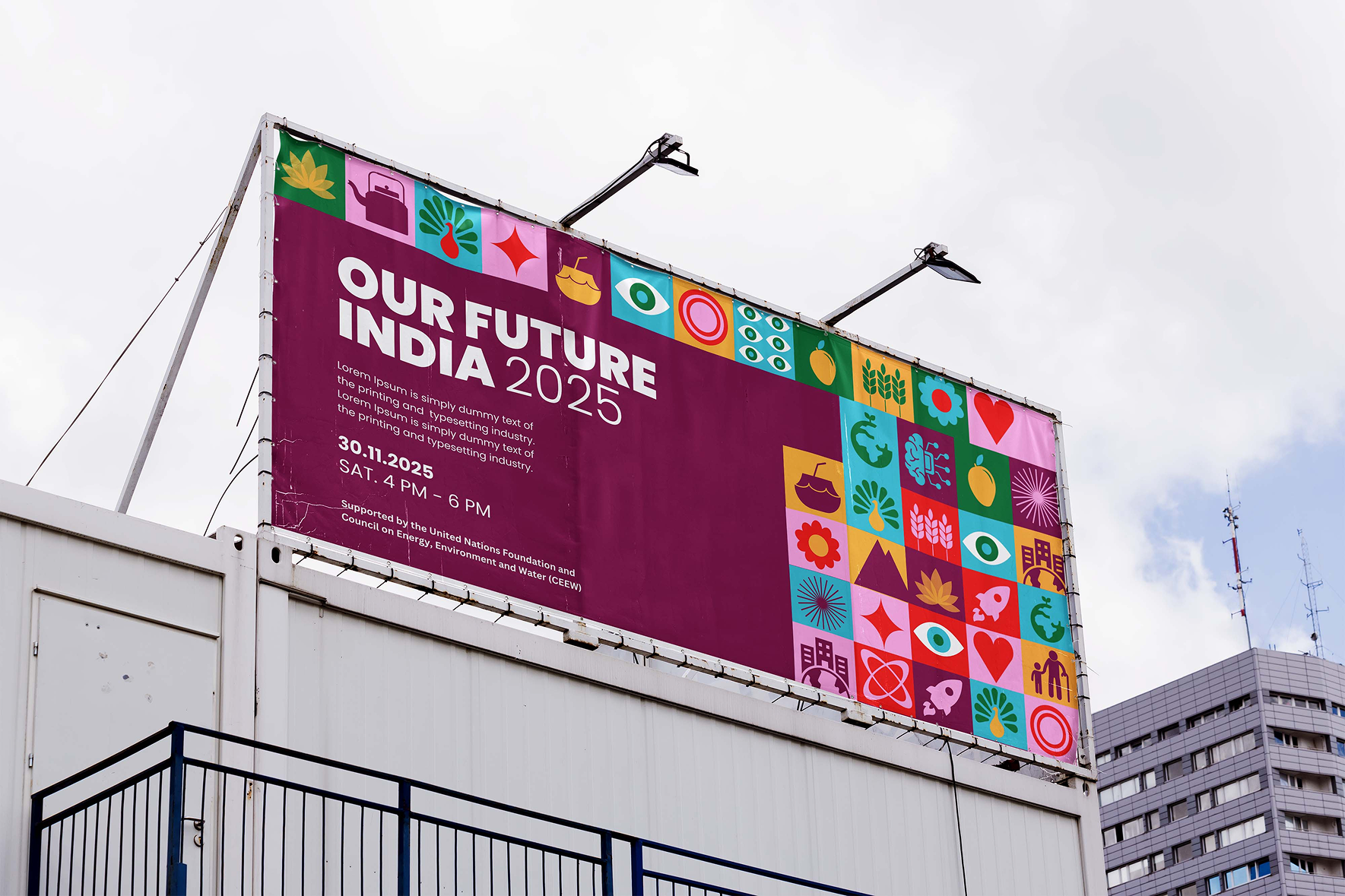
A bold, youth-driven identity co-created with young changemakers across India. Designed to feel rooted, joyful, and unapologetically Indian.
Project Overview
India is home to the largest youth population in the world. Our Future India was launched as part of the UN Foundation’s Our Future Agenda to ignite conversations among young Indians about the kind of future they want to shape. The campaign needed a visual identity that could hold the country’s contrasts, channel the optimism of its youth, and feel fresh, flexible, and deeply relatable.
We were brought in to create this visual identity from the ground up—guided by insights from young people themselves.
Our Approach
We started with a simple commitment: to listen first.
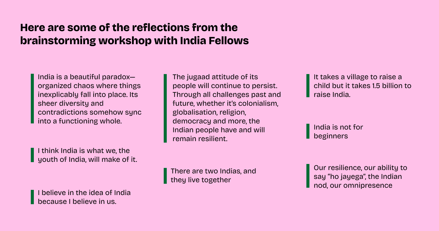
In a storytelling-based workshop with young changemakers from across India, we heard reflections that were raw, witty, honest, and layered. Participants spoke about resilience, chaos that works, the ever-present tension between tradition and change, and a shared belief in the collective spirit of the country.
These reflections didn’t just inform the design—they became the foundation. The visual identity had to feel lived in. It had to reflect the paradoxes without simplifying them. It had to be expressive, culturally grounded, and accessible across urban and rural contexts, digital and physical platforms.
Visual Identity Elements
Logo
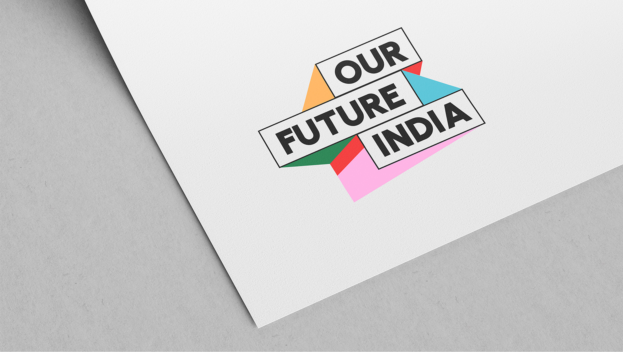
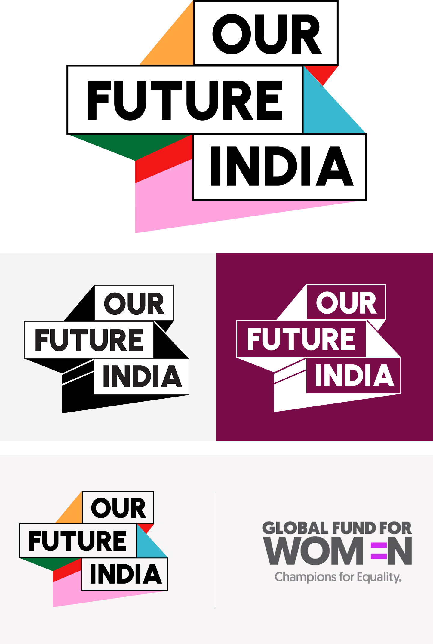
The “Our Future India” logo system captures the optimism, ambition, and forward-thinking spirit of India’s youth. Designed with bold geometry and vibrant colors, it symbolizes a generation prepared to lead with confidence and vision. This system is built for flexibility, offering a primary logo, alternate versions for varied backgrounds, and co-branded lockups for partnerships.
Each variation retains the brand’s visual integrity and accessibility. The logo’s dynamic form reflects strength and inclusivity, making it adaptable to multiple formats without losing its impact. Clear space and scale guidance ensure consistency across all applications. Together, these elements present a cohesive identity that is both modern and meaningful.
Colour Palette
We chose colours that evoke memory, feeling, and familiarity—without resorting to the usual tropes. Each hue has cultural depth and emotional texture:
- Laal Mirch (Spiced Red) – bold and high-energy, associated with both celebration and movement-building
- Haldi Peela (Turmeric Yellow) – warm and sacred, linked to rituals, healing, and optimism
- Night Jamun (Deep Maroon) – rich and contemplative, inspired by ripe fruit, old cities, and layered histories
- Neela Aasmaan (Sky Blue) – calm and expansive, evoking openness and clarity
- Hariyali (Fresh Green) – lively and fertile, a nod to growth and agrarian identity
- Gulab Mithai (Sweet Pink) – playful and gentle, reminiscent of festival sweets and everyday tenderness
This palette allows designers and youth campaigners to create both high-energy visuals and quieter, more reflective ones. It supports both celebration and critique—something essential for a campaign that invites civic engagement.

Typography
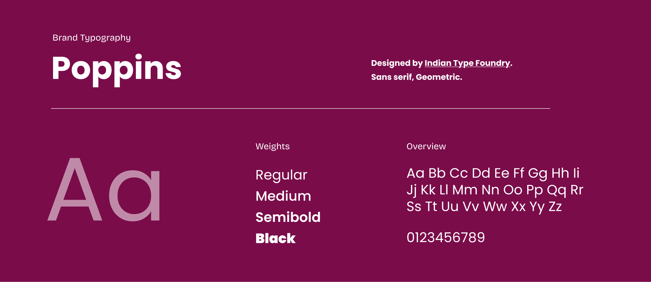
We selected Poppins by the Indian Type Foundry as the primary typeface. Its geometric clarity gives messages weight and clarity, while its rounded edges soften the tone, making it more inviting. It’s easy to use, available in multiple weights, and aligns well with both print and digital formats.
Icons and Motifs
The identity draws from India’s visual culture in subtle ways.
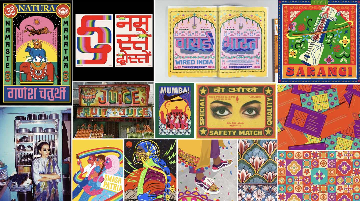
Rather than defaulting to literal national symbols, we worked with modular forms and textures inspired by Indian crafts, rangoli patterns, and street signages. The shapes suggest energy in motion—lines that break, reform, and recombine—mirroring the spirit of jugaad, adaptation, and collective problem-solving.
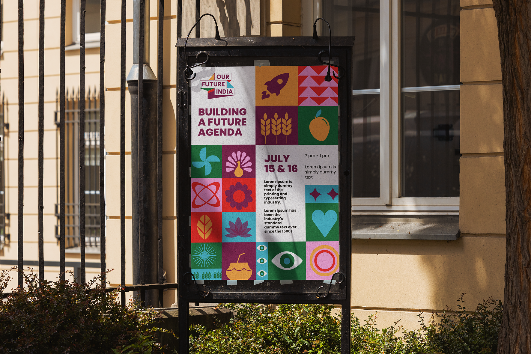
These motifs show up as background elements, dividers, and highlight graphics in templates. They’re designed to be remixed and reused, allowing campaign materials to feel both consistent and locally customisable.

Application and Flexibility
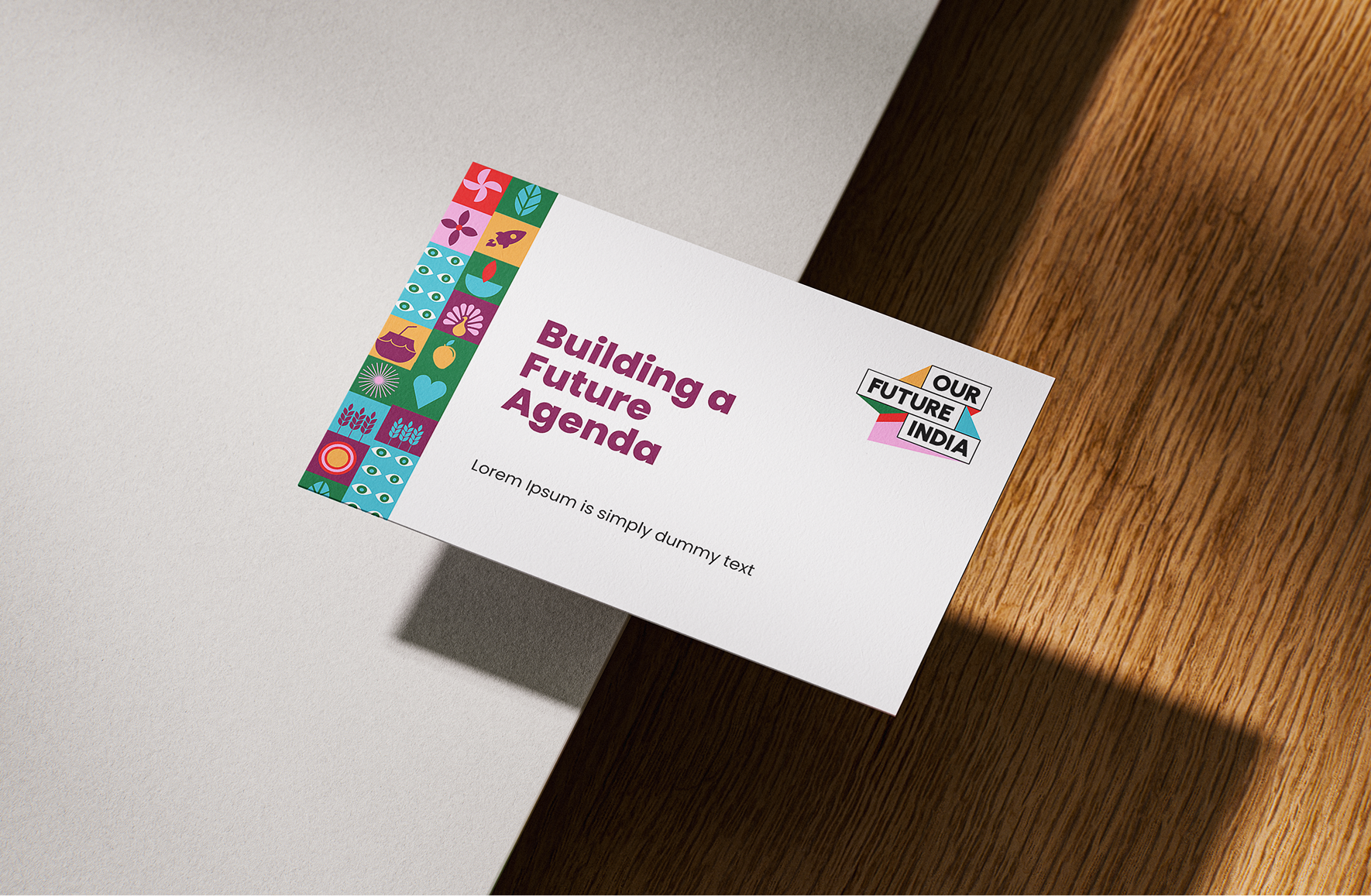
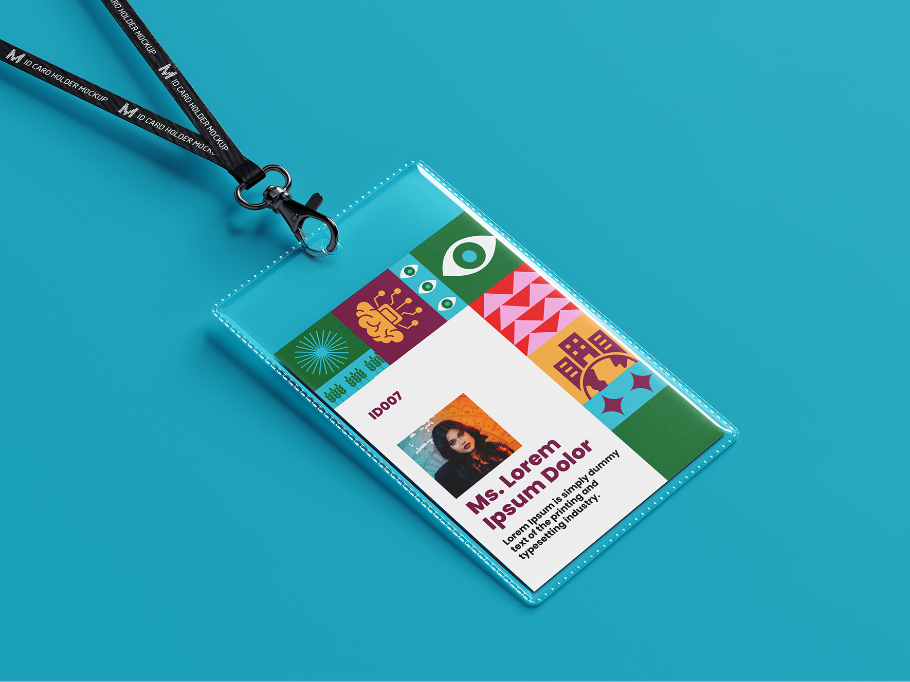
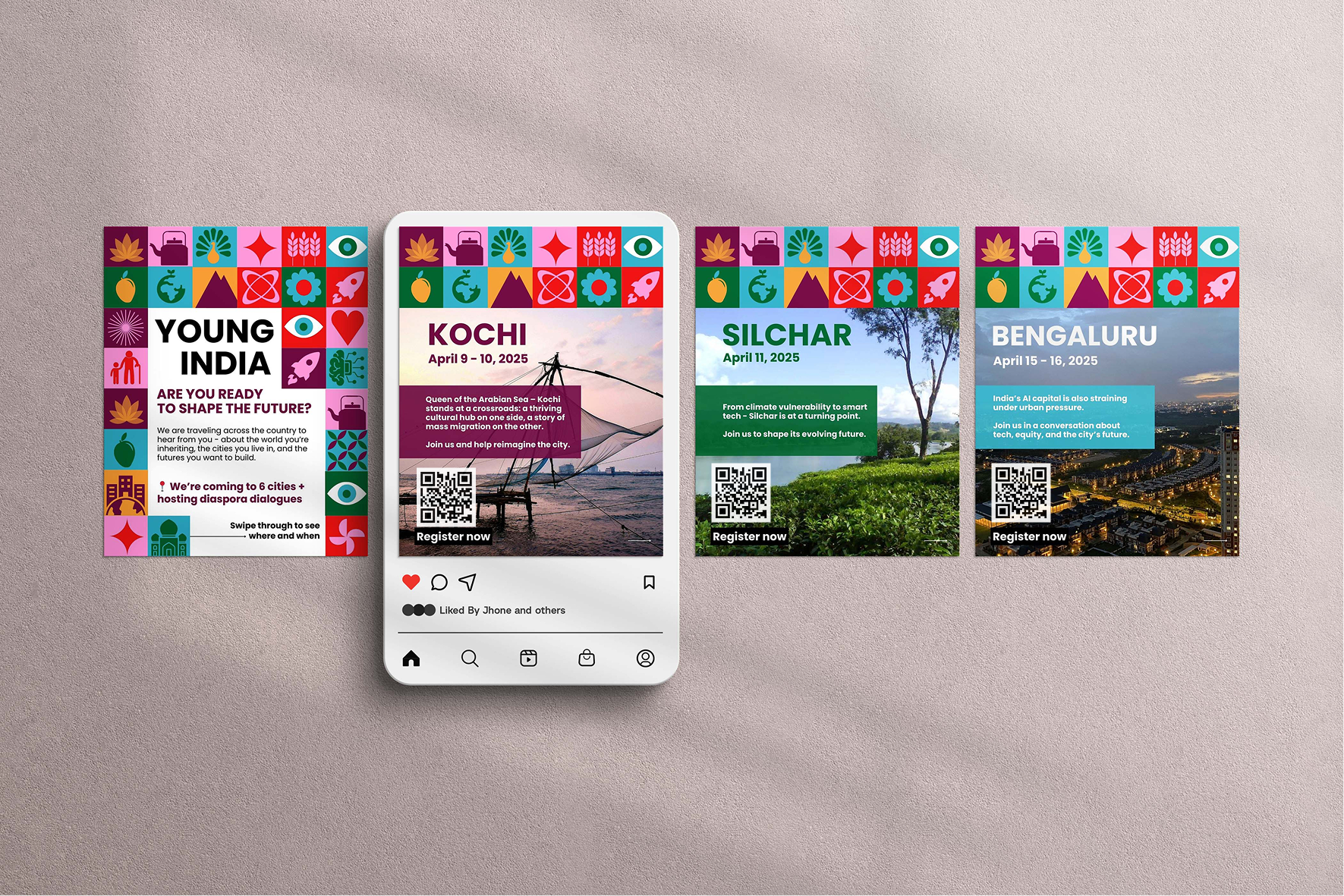
We designed the system to be usable by people with a range of design skills. From Canva templates for youth teams to high-res assets for print and web, the visual language adapts easily across platforms.
Alternate logo versions were created to ensure clarity and contrast across various uses. Colour contrast and font sizing followed accessibility standards to support legibility across audiences.
Every piece of the identity, from headers to footers, icons to lockups was built to function as part of a larger story.
Outcomes
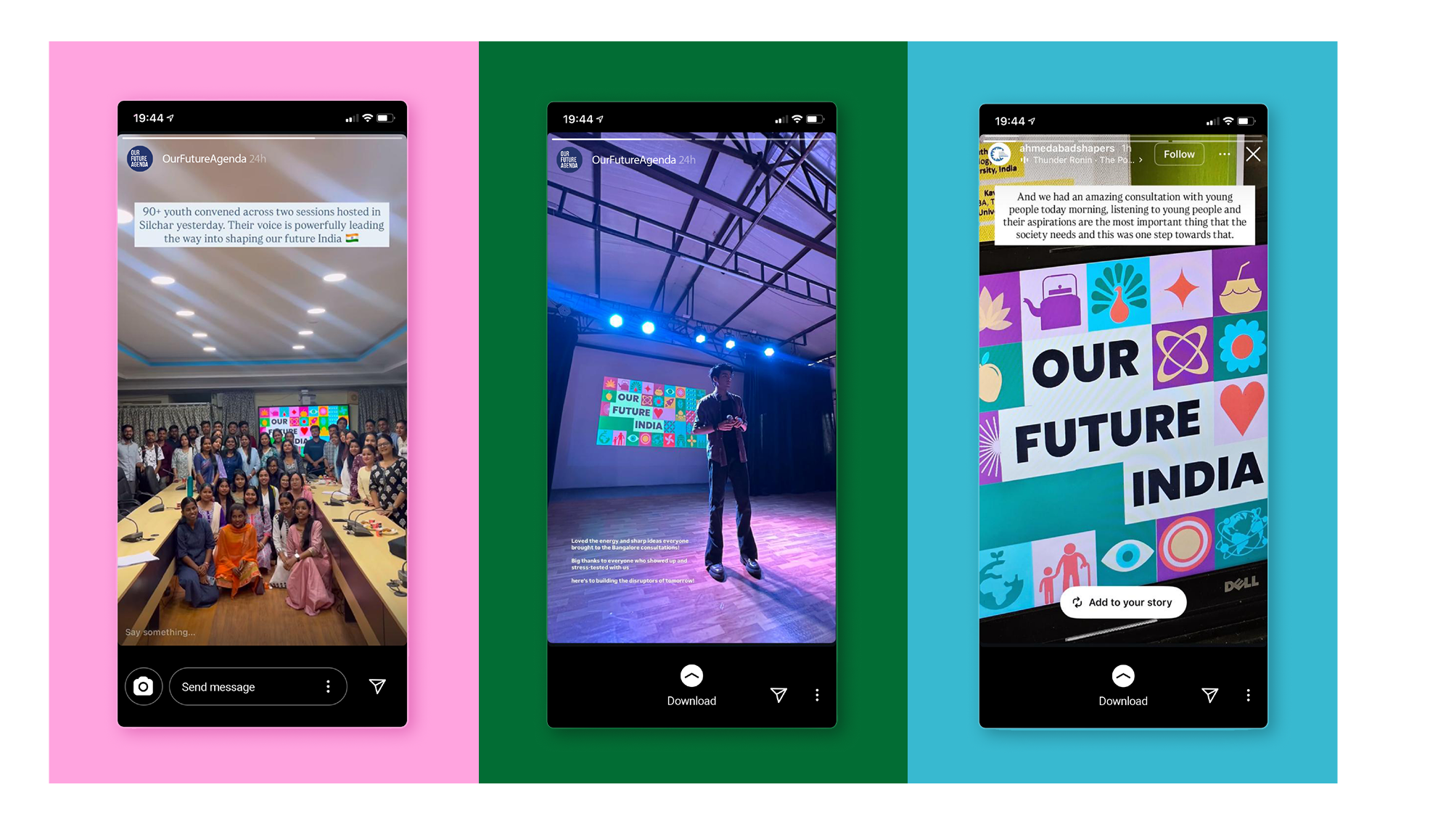
The identity now lives across national consultations, digital events, printed toolkits, and social media content. It has helped Our Future India create a recognisable, flexible presence that feels both credible and personal.
By grounding the visual language in real youth voices and lived experiences, the brand has been able to foster stronger participation, deeper ownership, and a sense of belonging among those it seeks to serve.
Client Testimonial
Reflection
Designing for Our Future India was a chance to co-create with a generation that is actively rewriting the country’s story. This project reaffirmed something we hold close as a studio: design becomes meaningful when it reflects people’s realities and helps them see themselves in the future.