Designing with Purpose – A visual identity brochure

Client
Relationship
Services
A visual identity brochure for the WHRDIC
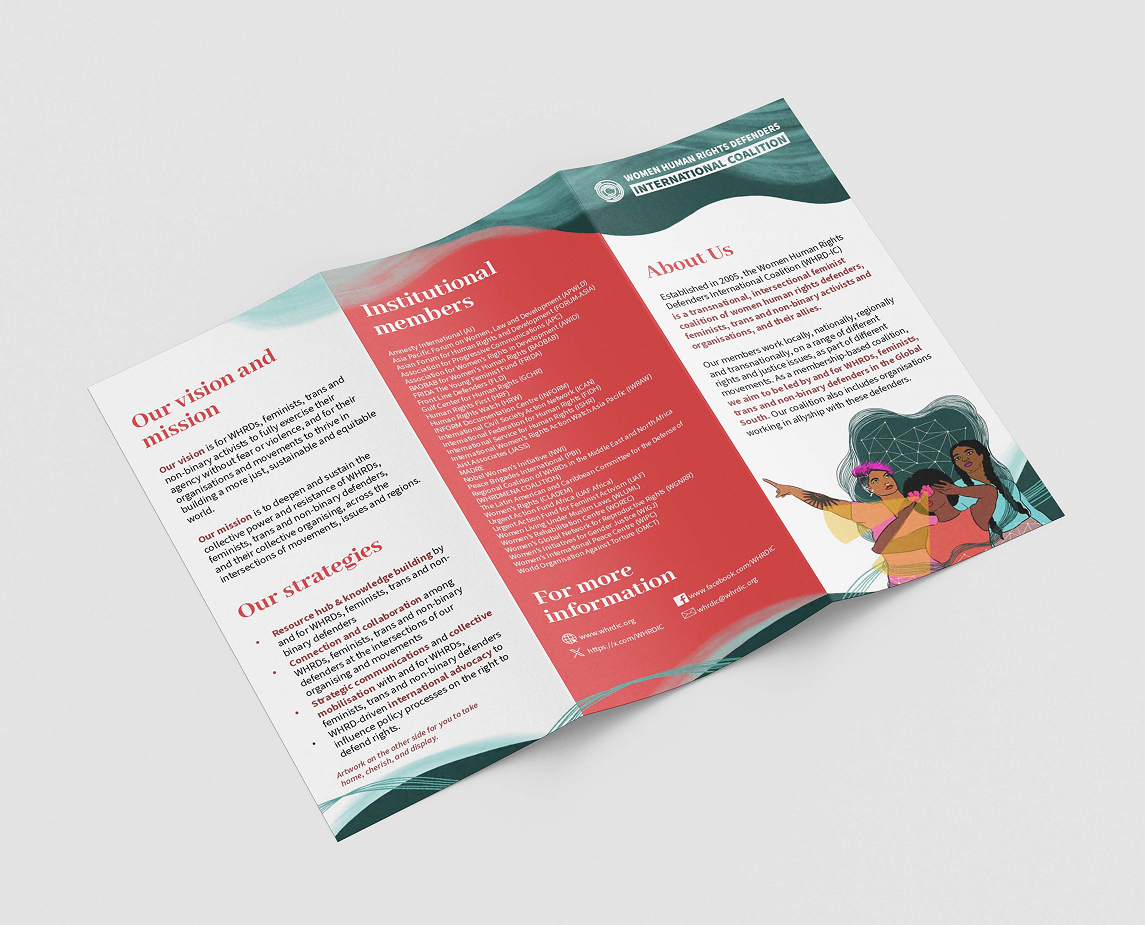
A fold-out brochure for WHRDIC that carries their mission with warmth and clarity. Made to connect, inform, and stay with you.
The Project
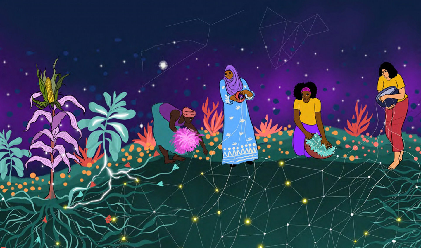
When WHRDIC approached us, they weren’t looking for a corporate brochure. They were looking for something that could feel like an offering—a piece of design that could travel across conferences, convenings, and community spaces, carrying the coalition’s heart, work, and values in every fold.

Our Approach
The goal was to hold complexity while remaining accessible. The coalition is vast, multilingual, and movement-based. The people reading this might be first-time allies, long-time members, or defenders working in difficult conditions. So the design needed to work across time zones, languages, and energy levels.
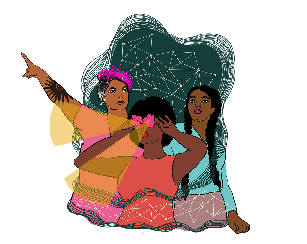
We structured the layout to be skimmable yet substantive. The cover invites curiosity. The inner fold holds the core—who WHRDIC is, what they stand for, and how they connect. The back features contact information and a quiet visual invitation to keep it, share it, or display it.
Visual Language
- Typography: We chose fonts that balanced warmth and readability. Large enough for older eyes, soft enough to feel inclusive, bold enough to claim space.
- Color: The palette leaned on deep purples, muted rose, and earth tones—grounded, feminist, and globally resonant.
- Layout: Space was just as important as text. We allowed breathing room to prevent overwhelm and give each section dignity.
- Tone: We kept the copy straightforward and steady. No jargon, no assumptions. Just clarity, care, and confidence.
We also kept in mind the multiple uses of this brochure. It could sit on a resource table at a UN event or be tucked into a folder for a workshop in Nairobi or Manila. It had to be functional and beautiful, formal yet emotionally open.

What It Holds
- A vision for a world where defenders are safe, supported, and resourced.
- The coalition’s mission and strategies—framed not as abstract values but as collective practices.
- A full list of institutional members, each representing a piece of the global tapestry of resistance.
- Contact information designed for ease, across platforms, including web, email, and social.