
A Membership campaign Identity for Collective Action
with Bond
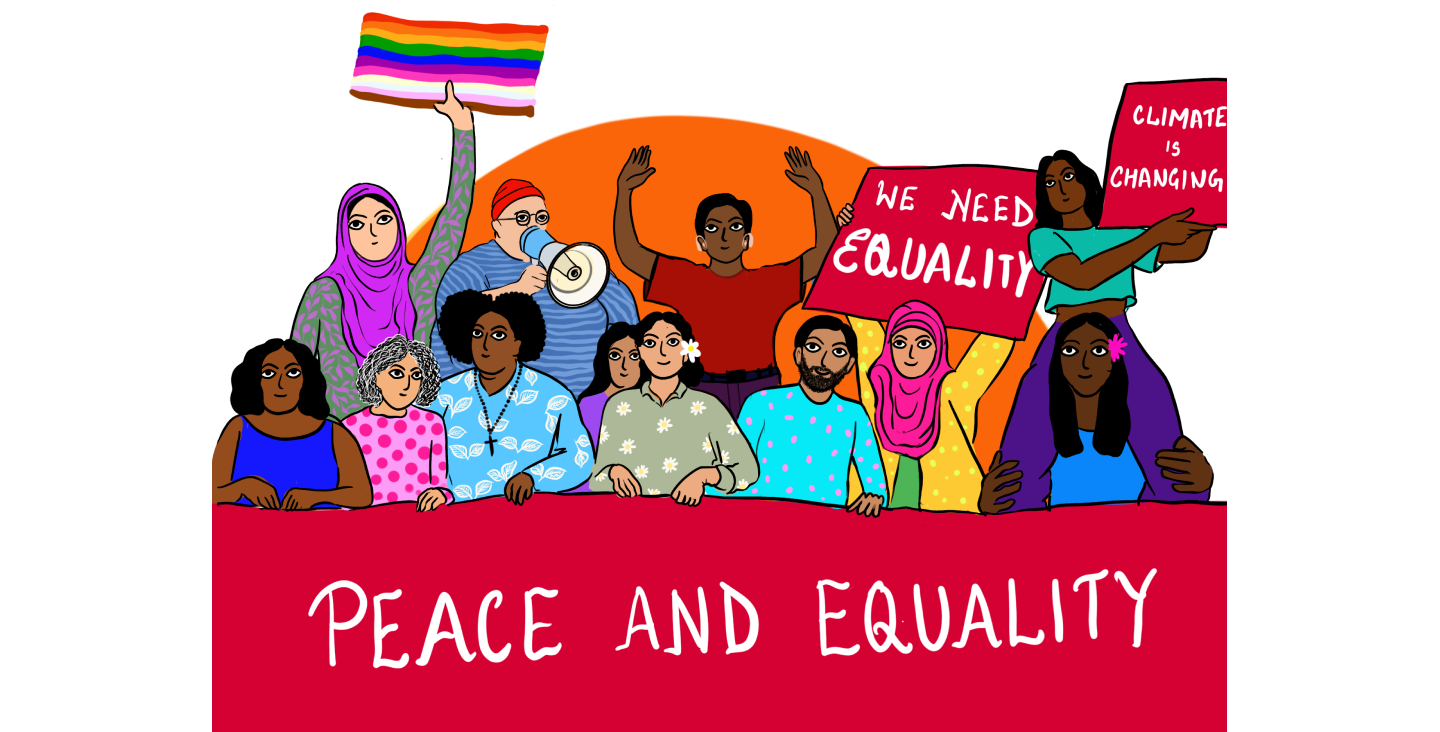
Client
Bond
Relationship
Since 2020
Services
Campaign visual direction, brand extension, illustration system, social media assets, campaign messaging support, and digital communication assets.
A Membership built on collective thriving
Design for a dynamic network of over 330 civil society organisations working together to drive global change.
Introduction
Bond is the UK network for organisations working in international development and humanitarian action. Its membership page positions Bond as a dynamic network of more than 330 civil society organisations working together to drive global change, with member benefits spanning peer support, working groups, events, resources, training, jobs, news, and sector insights.
For Bond’s membership drive campaign, We Are Stories was invited to create a visual identity and campaign asset system that could encourage more organisations, professionals, consultants, and sector actors to engage with Bond’s membership ecosystem.
The campaign needed to communicate one core idea clearly: Bond membership is not just a sign-up. It is a way to connect, learn, influence, hire, share knowledge, access opportunities, and contribute to the future of the international development sector.
The Challenge
Bond already had a strong and recognisable brand identity. The task was not to redesign the brand, but to extend it into a campaign world that felt fresh, warm, inclusive, and action-oriented.
The campaign had to speak to different membership motivations:
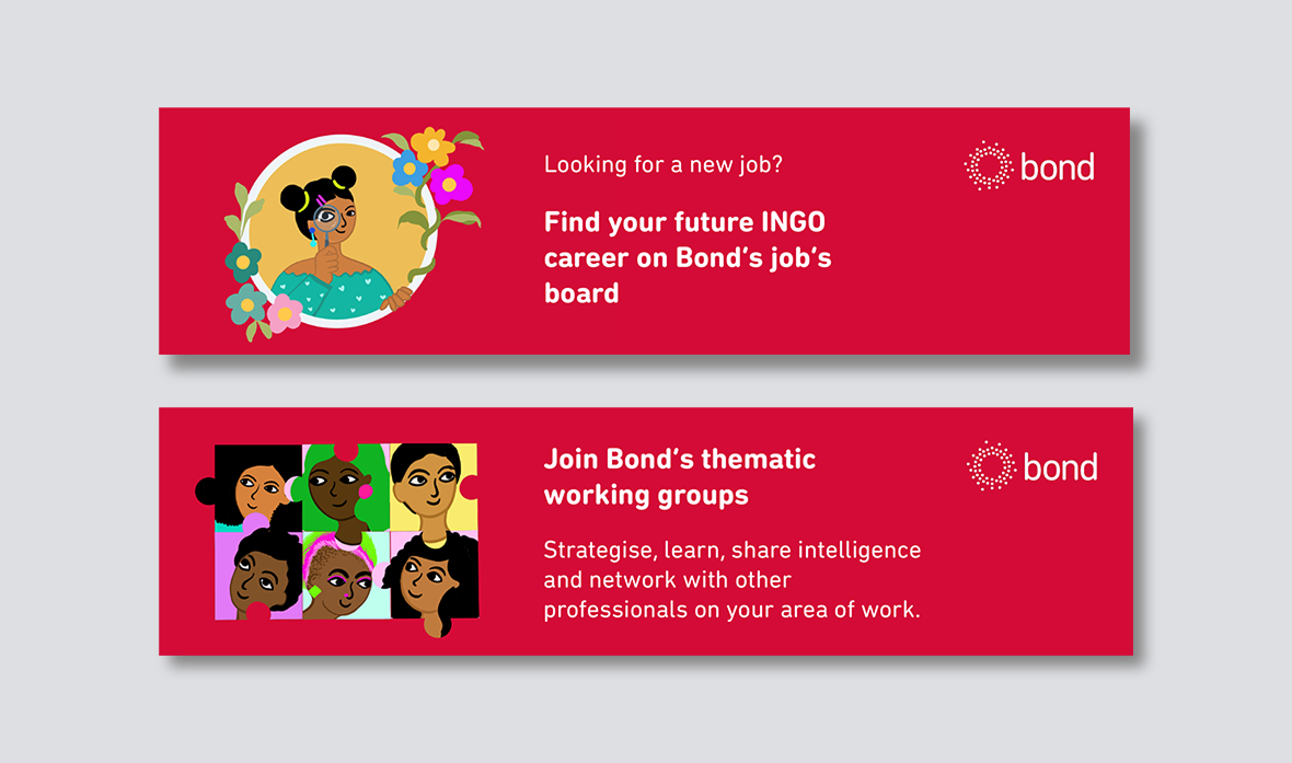
- Joining working groups
- Accessing funding opportunities
- Advertising jobs
- Finding INGO talent
- Joining the supplier directory
- Receiving sector news and updates
- Engaging with debates around anti-racism, locally led development, funding, and alternatives to the humanitarian and development system
The key challenge was to make these membership benefits feel human and inviting, without losing Bond’s institutional clarity or sector credibility.
Campaign Concept
We developed the campaign around the idea of membership as participation.
Instead of treating membership as a static offer, we visualised it as a set of roles people can play inside a wider ecosystem. Members could be knowledge seekers, advocates, connectors, employers, service providers, funders, strategists, organisers, and collaborators.
This helped us create a campaign language that was active and people-centred. Each asset focused on a specific action:
Join. Search. Sign up. Advertise. Ask. Find. Engage. Shape.
The campaign visuals were designed to make Bond’s membership ecosystem feel alive, useful, and accessible.
Visual Direction
The look and feel was created to sit cohesively within Bond’s existing identity while adding a more expressive illustrated layer.
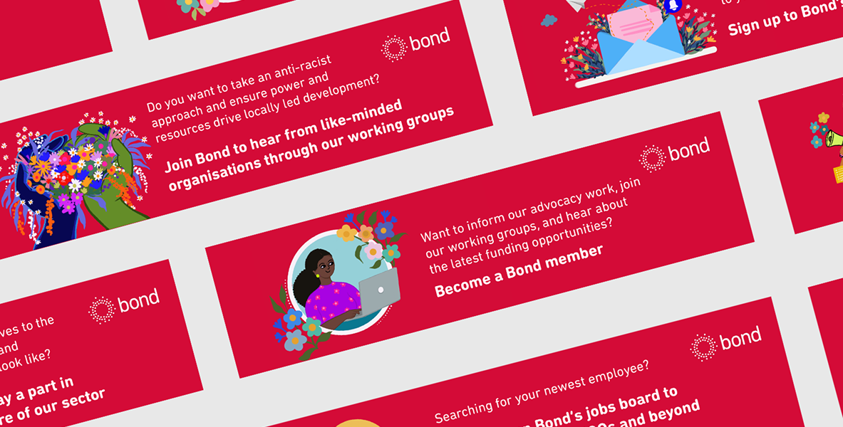
We retained Bond’s bold red as the dominant campaign colour, using it as a strong background system across the assets. This helped maintain immediate brand recognition and gave the campaign a consistent visual anchor.
Against this, we introduced colourful, hand-drawn illustrations that brought warmth, movement, and personality into the communication. The illustrations used florals, human figures, symbolic objects, and everyday work tools to show the different ways people engage with Bond’s network.
The visual system balanced three things:
Brand continuity : The campaign stayed close to Bond’s existing identity through colour, logo placement, and direct messaging.
Human warmth : Illustrated people, gestures, and community scenes made the campaign feel approachable and relational.
Role-based storytelling : Each illustration represented a specific membership function, from hiring and networking to advocacy and funding conversations.
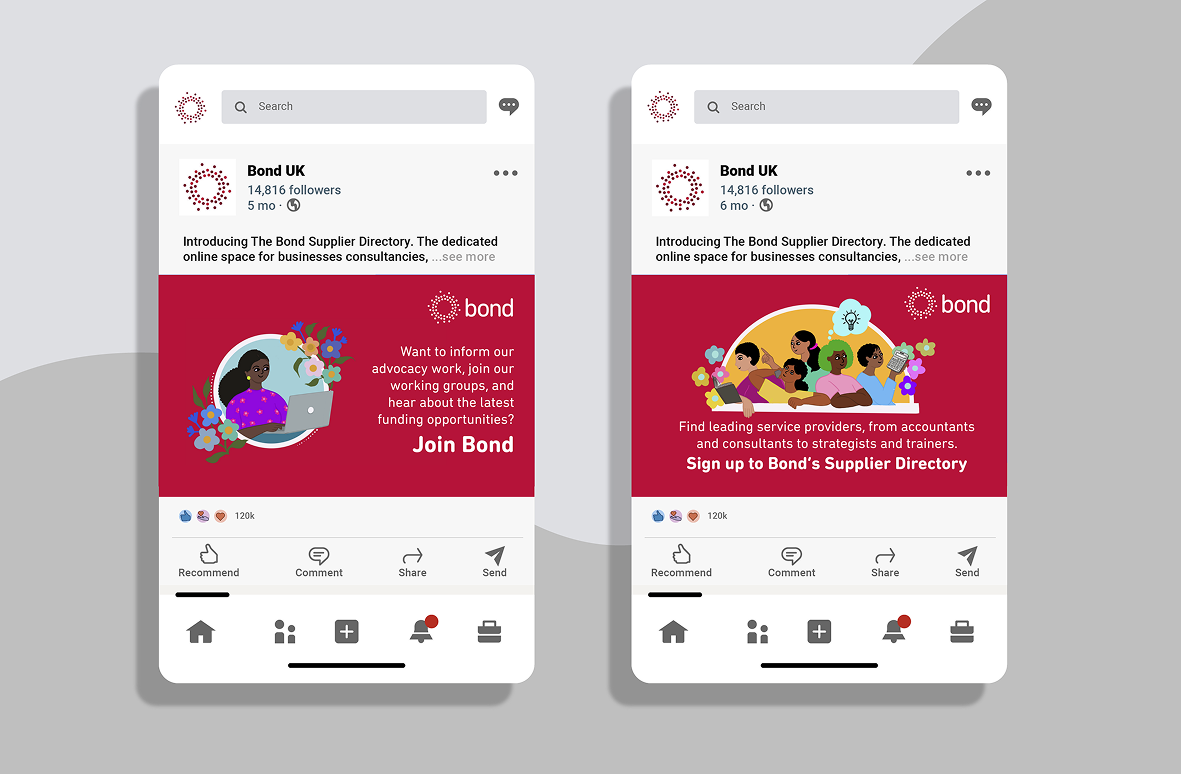
Illustration System
The illustrations were created around the different roles Bond membership plays in the sector.
For example:
The job seeker and recruiter : Magnifying glasses, people searching together, and job board references helped visualise hiring, discovery, and sector talent.
The advocate and organiser : Megaphones, speech bubbles, and groups of people represented campaigning, working groups, and collective voice.
The knowledge sharer : Letters, newsletters, notifications, and inbox imagery represented Bond’s Network News and sector updates.
The collaborator : Puzzle-like portraits and group compositions represented working groups, peer learning, and professional connection.
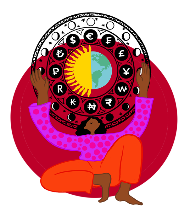
The funder and future-builder : Currency symbols, circular systems, flowers, constellations, and joined hands helped communicate funding futures, solidarity, and shared responsibility.
The supplier and service provider :
- Characters holding tools, books, calculators, and thought bubbles helped position the supplier directory as a space for practical support and professional expertise.
- The floral elements became an important recurring motif across the campaign. They softened the directness of the promotional messaging and created a sense of growth, care, and collective flourishing.

Messaging and Asset Design
The campaign messages were designed to be direct, practical, and action-led.
Each asset used a clear question or need, followed by a strong call to action:
- “Looking for a new job?”
- “Searching for your newest employee?”
- “Want to inform our advocacy work?”
- “Looking to advertise your services to the UK’s INGO sector?”
- “What do you think the future of funding in the international development sector should look like?”
- “What could alternatives to the current humanitarian and development system look like?”
This structure made the assets easy to understand at a glance. It also allowed Bond to speak to different audiences without changing the overall campaign identity.
The membership page highlights that Bond members can connect through working groups, access resources, attend events, receive sector news, use jobs support, and benefit from training and other member services. The campaign translated these benefits into visual stories that could work across social media and digital communications.
Outcome
The final campaign created a cohesive and recognisable asset system for Bond’s membership drive.
We delivered a set of illustrated digital assets that could be used across Bond’s communication channels to promote membership, working groups, job advertising, the supplier directory, funding conversations, newsletters, and sector engagement opportunities.
The campaign gave Bond a warmer and more visually distinctive way to speak about membership. It helped turn a broad organisational offer into a set of clear, human, and action-oriented invitations.
For We Are Stories, this project reflected the value of visual storytelling in institutional communications. The work showed how a strong campaign system can extend an existing brand while making its services feel more accessible, relational, and alive.
Conclusion
Bond’s membership offer is built around connection, collaboration, learning, advocacy, and sector support. Our role was to translate that offer into a visual campaign that felt clear, cohesive, and human.
By creating a flexible illustration system rooted in Bond’s existing identity, we helped build a campaign language that could speak to different audiences while still feeling part of one shared world.
The result was a membership drive campaign that made Bond’s network feel less abstract and more immediate: a place to find people, share expertise, shape conversations, and participate in the future of the sector.