This is the Work – Applying anti-racist and decolonial approaches to policy and advocacy
with Bond and Peace Direct
Client
Bond and Peace Direct
Relationship
Since 2021
Services
Illustrations, infographics, sensemaking, publication design, layout design
Designing Justice: Visual Toolkit for Change
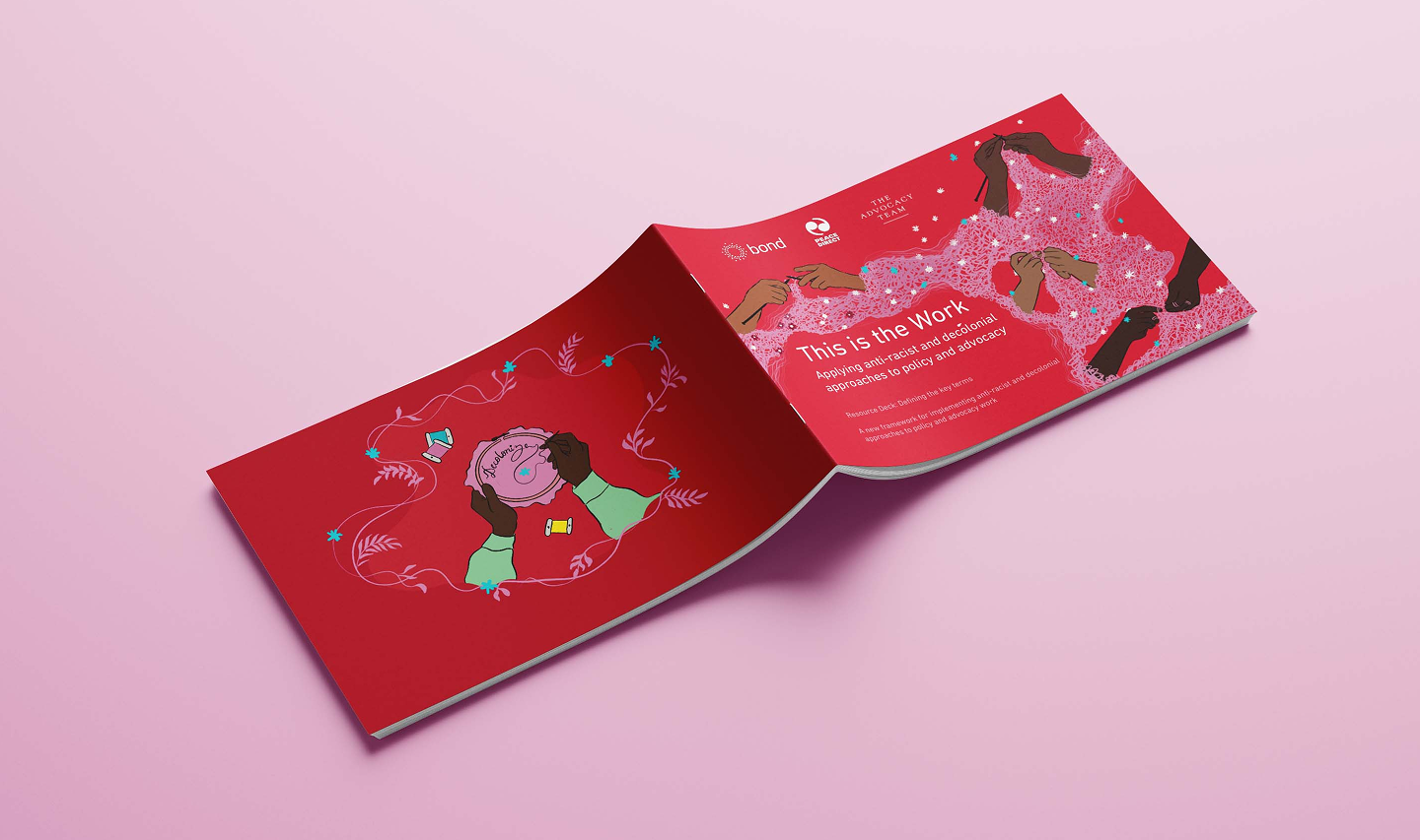
A visual toolkit to embed anti-racist, decolonial, and equity-centered practices in international policy and advocacy—crafted to support everyday change-makers across the sector.
The Brief
Bond and Peace Direct were building something different. Rather than a dry policy paper, they envisioned a working document—a tool for self-reflection, team discussion, and practical implementation of anti-racist and decolonial principles in global development spaces. They asked for a design that didn’t feel corporate or detached, but instead resonated with movement energy: informed, clear, unafraid to challenge, and grounded in lived realities.
Our challenge was to translate dense, nuanced theory into a visual format that felt accessible without being reductive. The final result had to walk the line between policy resource and political provocation, clarity and complexity, definition and disruption.
Our Approach
We began by mapping the emotional and conceptual landscape of the document – where were the ideas most charged? Where did readers need to slow down? Where could illustration aid comprehension, and where could design help build a sense of momentum?
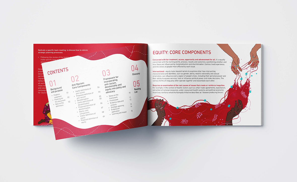
The structure of the deck flows through a clear arc: defining foundational terms like anti-racism, decolonisation, and equity, before introducing a new framework for practical application. We leaned into this rhythm with consistent, visual anchors – each major section framed by a shift in tone, layout, and graphic composition to help the reader move between deep reflection and action planning.
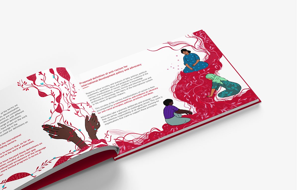
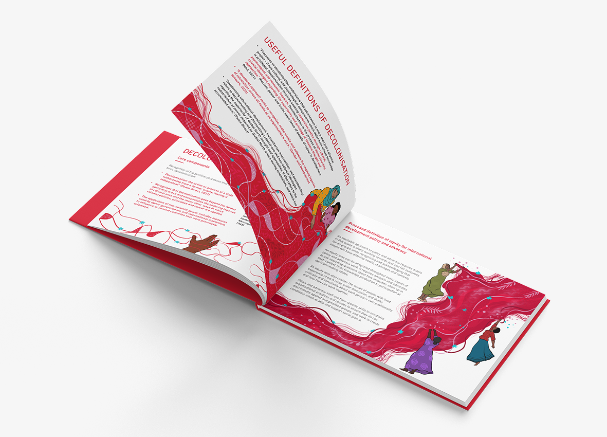
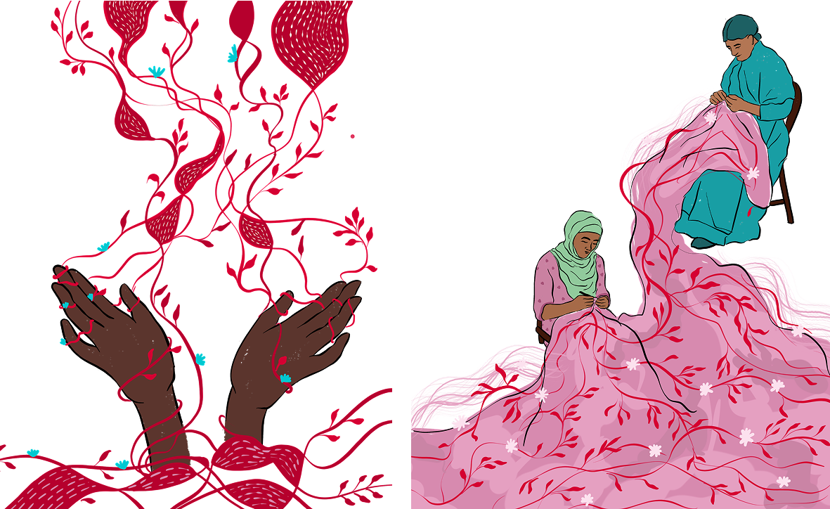
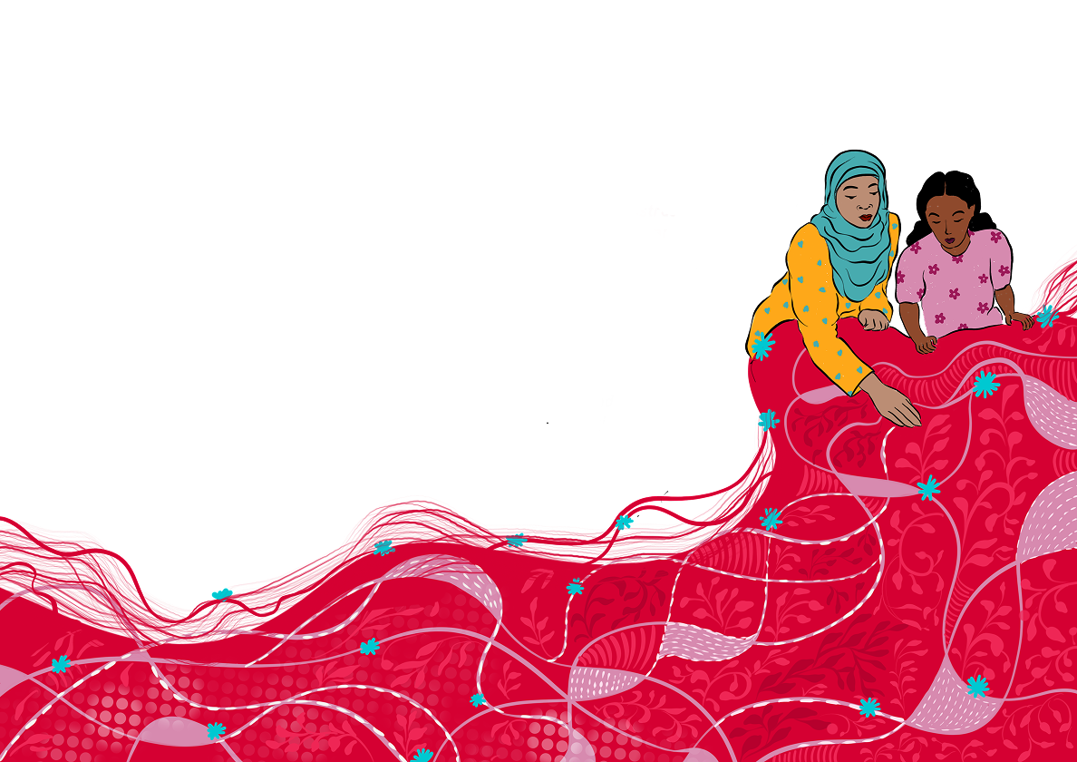
We introduced soft, hand-drawn illustrations and icons as a counterpoint to rigid policy language. These were inspired by visual metaphors of unlearning, branching systems, collaboration, and power redistribution. From deconstructed colonial columns to tangled roots being unraveled, each image invites the reader to feel the work – not just read it.
Infographics played a key role in bringing clarity to abstract frameworks. We translated multi-step evaluation rubrics, planning guides, and intersectional analysis tools into clean, digestible formats. Layouts used generous white space, gentle color transitions, and quiet visual cues to create a sense of spaciousness so teams could use this document not just once, but return to it repeatedly in workshops and planning sessions.
Visual Storytelling Highlights
- Color Palette: A combination of warm earth tones and muted purples with subtle gradients chosen to evoke calm, grounding energy while holding space for depth and discomfort.
- Illustrations: Minimalist yet symbolic visuals that mirror the layered and intersectional nature of the subject. Each illustration was designed to spark intuitive understanding and dialogue.
- Icons & Infographics: Developed a consistent visual language for framework components, strategy planning tools, and glossary terms enabling quick visual recall and reinforcing system-level thinking.
- Layout: The deck was structured with a horizontal reading flow and page breaks that supported team discussion. Definitions were given space to breathe, while frameworks were laid out to be printable and workshop-ready.
Outcome
This is the Work is more than a policy tool, it’s a conversation starter, a community guide, and a quiet challenge to business-as-usual in the international development sector. By embedding visual storytelling into the very heart of this document, we helped create a resource that speaks across roles, encourages accountability, and supports deep internal change.
We are grateful to have supported this project, one that refuses simplification and instead insists on the complexity of justice.